15 things I learned working in advertising.
Recently my coworkers endured an unabbreviated version of this Lunch & Learn presentation (originally “30 Things I Learned Working in Advertising”) in exchange for pizza. There will be no pizza this time, but to make it up to you, I’ve narrowed the list down to the best 15.
#1

We often perceive design needs that don’t exist.
Features that don’t solve a problem tend to create problems.
#2
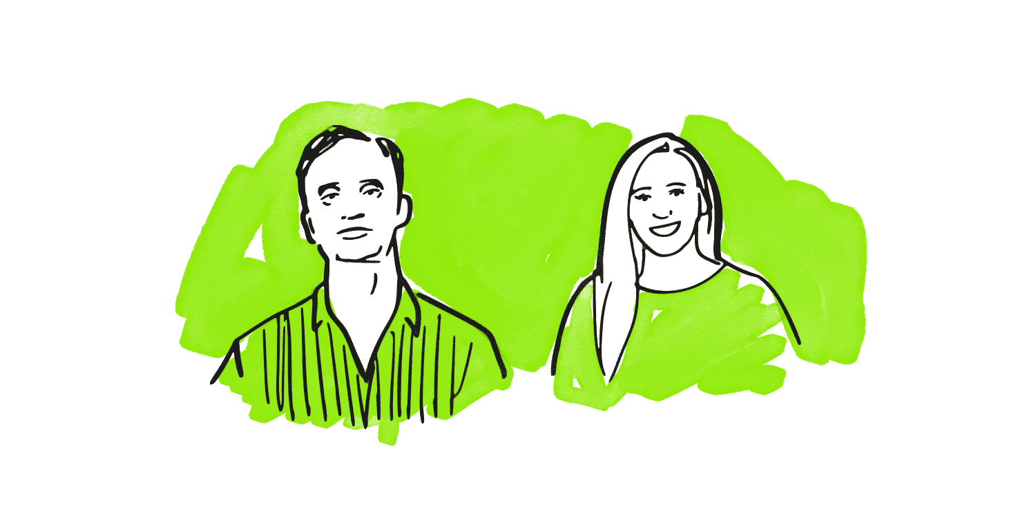
It’s easier to learn from your coworkers than on your own.
Even if you have to join the “run club.”
I have a great idea for a podcast. If I can rig a voice recorder with a really good windscreen I could broadcast all of the cool dev tricks that I learn from Planit’s developer Michael Scherr on our runs. But that’s probably not going to happen. So go on a run with him sometime. Or sign up for kickball. Or invite a coworker out for a beer. It can make a huge difference.
#3
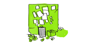
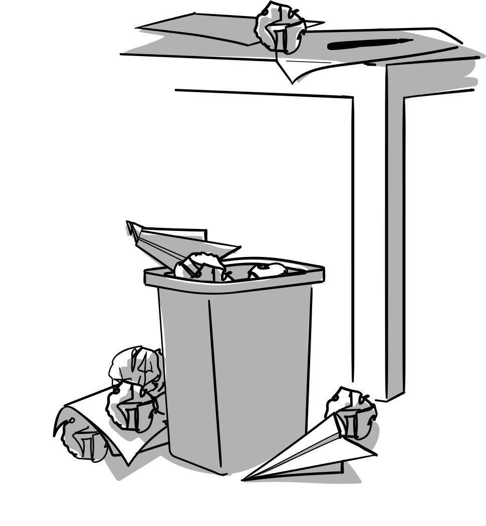
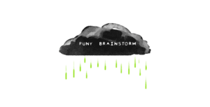
Most ideas are garbage, and that’s okay.
When a design problem is overwhelming, sometimes getting all the bad ideas out helps.
#4
The best way to Photoshop a coworker’s face onto another’s is to align their eyes.
But it will be funny no matter what.
#5

Investing time in a first draft often saves time in the long run.
Find small problems early before they turn into big problems later on.
When I was in architecture school, my junior year studio professor encouraged me to make 1:100 scale models on the first day of a project (something previously reserved for the final charrette). By the next day, the problems that would have killed the project weeks down the road had already killed the project 9 times over. What I was left with was 9 times better. Later while working in advertising, I learned that I could use feedback from my coworkers to the same effect. The more we tore down from our pin up walls, the better the ideas got.
#6
Design limitations increase creativity.
Does the banner ad live on a weird website?
Does the site need to be 508 compliant?
Does the video need to work in fewer than 5 seconds?
#7
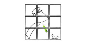
Simple diagrams illustrate big ideas better than complicated ones.
Working with a wireframe (a near 1:1 diagram of a website) is incredibly helpful to efficiently communicate what the details of a website design are. No questions there. But you’ll often get different answers when asked why the details look that way.
#8
Freelancing is a great way to learn new skills, fast.
Albeit stressful.
Oftentimes signing up for something outside of your skill set is the quickest way to improve your skills. You benefit, your agency benefits, and your client realizes the value of a creative agency.
#9
It’s easier to squeeze executions out of a big idea than to squeeze a big idea out of an execution.
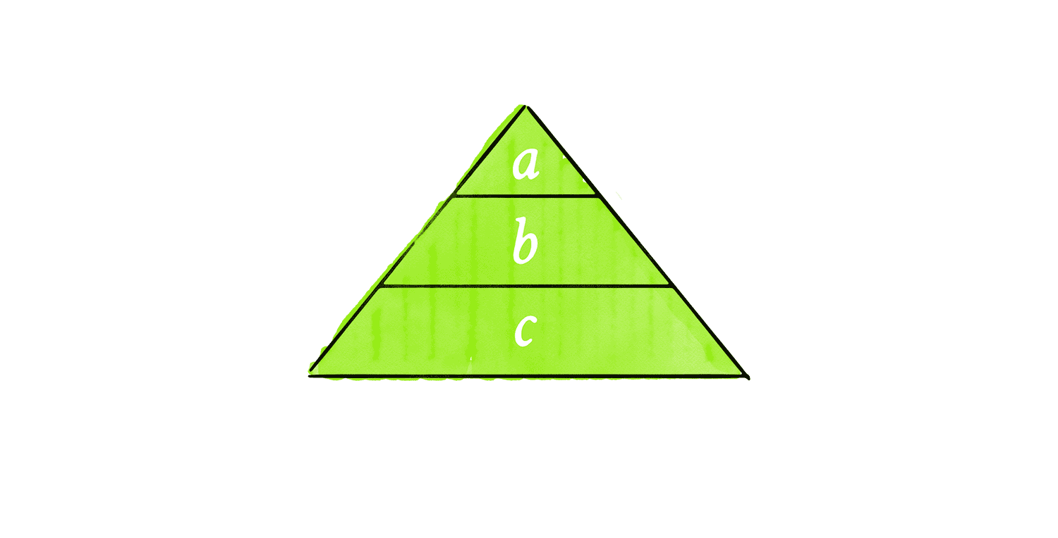
#10
Simple layouts are just fine.
Complex layouts are oftentimes less effective.
#11

This thing helps you fold paper.
Learned this one from our design intern Sam.
Thanks, Sam!
#12

Anti-Aliasing.
Pixels create jagged edges along the curves and diagonals of type and graphics. How do we smooth them out?
It’s kind of like the round peg in a square hole problem, but with graphics and pixels. The ancient Romans solved a similar problem by rotating their mosaic tiles tangent to the curve. Georges Seurat figured this out by breaking the grid. Welp, I’m very bad at tiling, and the pixels in my computer monitor are on a grid, so it’s best to just let the computer figure it out. It’s called anti-aliasing. With it we can make the line appear smoother, sharper, bolder, or even fuzzier just by calculating the averages between the edge and its adjacent pixels differently.
#13
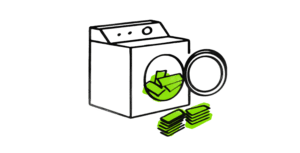
Adding imperfections to retouched photography makes it look more authentic.
Like money laundering.
All I know about money laundering I learned from TV. So, forgive this metaphor. If you ever need to splice two photos, shot at two different times, with two resolutions, in totally different lighting or any of the above, try “roughening” the image a bit. Adding noise, a filter, stretching (interpolating), or even JPG artefacts (those blurry squares you see on low-quality images) can help create a convincing (counterfeit) edit.
#14

Nesting!
Groups! Nodes! Tables! Tags!
Technically, I learned this in the third grade when my teacher, Mrs. Nemo, taught me to break down my essays into an intro paragraph, a few middle paragraphs, and an ending paragraph. Each of those paragraphs would further break down into an intro sentence, a few middle sentences, and an ending sentence. So on and so forth. Turns out that method lends itself to all sorts of things beyond state standardized testing. It helps organize all of my design files, code, folder structures, on and on. Thanks, Mrs. Nemo.
#15