Curio Wellness - Brand Refresh
A refresh that elevates what was always there.
Now, it’s more impactful than ever.


Client Challenge
Recreational use of cannabis continues to become legal in more and more places, which means it continues to be an increasingly competitive and cluttered marketplace. As such, Curio Wellness needed to amp up their differentiator game. Good news is, we didn’t have to reinvent anything. We just needed to take their “wellness” roots (it’s right there in the name) and bring them even more to the forefront in relevant, modern, and important ways.

Planit's Solution
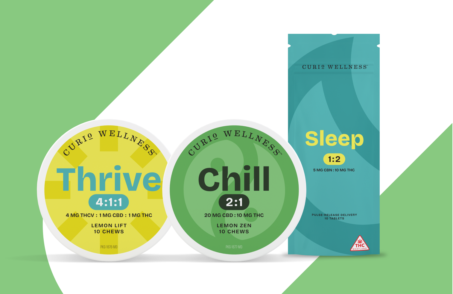
An entire platform that not only elevated Curio aesthetically, but spoke to the greater purpose and essence of the brand: Made for Well Beings. The effort included a complete rethinking of product organization and naming to help consumers find exactly the products they need to achieve the wellness they deserve.
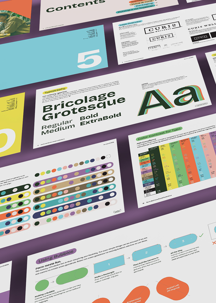
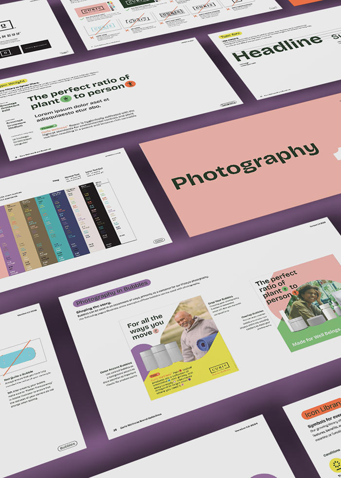
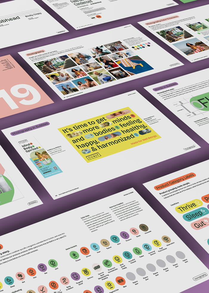
Brand Guidelines
The full brand identity system we created not only looks amazing, it works beautifully. And we made sure it stays that way by creating a robust and rigid set of guidelines that are easy to understand and follow.
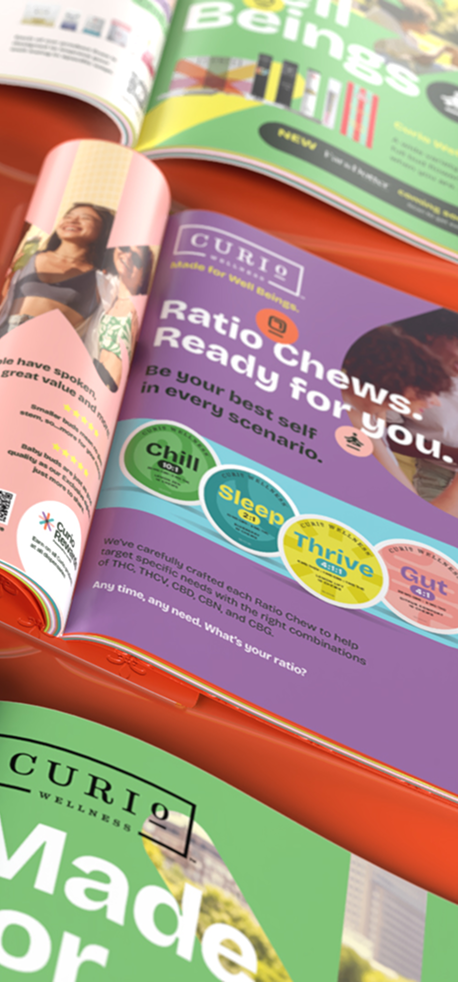
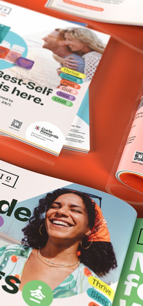
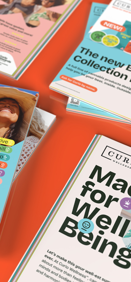
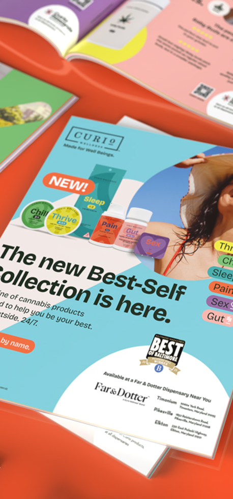
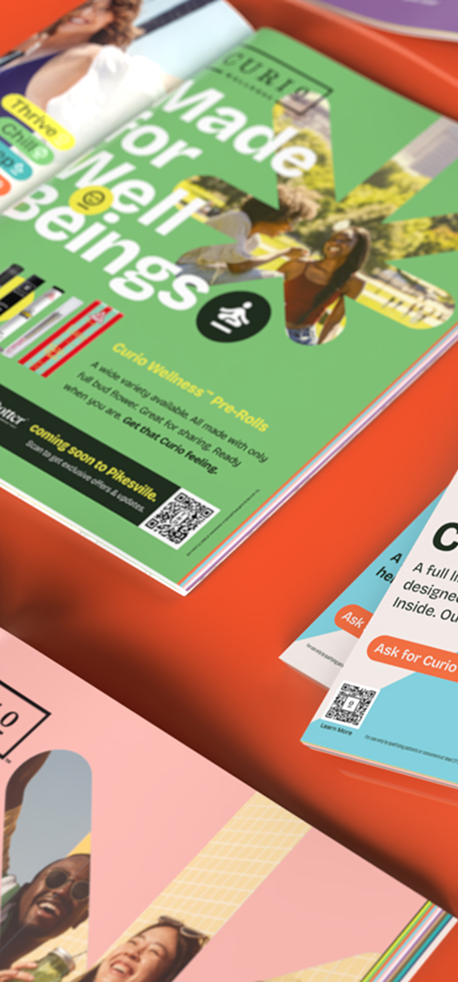
Cannabis-related consumer publications are a widely used medium for everyone from the lightly curious to those who are heavy users/active enthusiasts. Trade publications are a great way to build awareness for potential dispensaries and stay at the forefront of thought-leadership.
Icon System
Iconography is a key element of the visual identity and a nod ot our logo. These icons clearly, quickly, and with personality communicate everything from the forms our cannabis products take to the features, benefits, and feelings they produce. “Bubbles” (as we like to call them) are the signature multi-purpose shape that connects our visuals with playfulness, color, and energy.
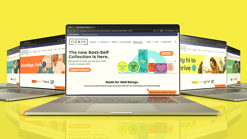
Website
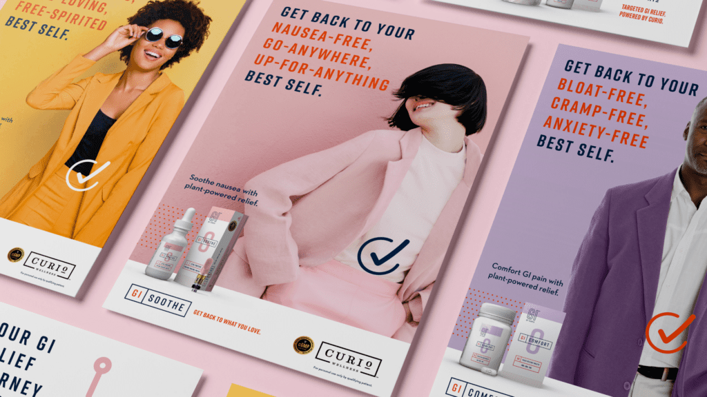
There’s a lot of education to be had when it comes to cannabis, and even more when it comes to cutting through the cluttered vastness of the industry. There’s also a lot of opportunity to differentiate the Curio brand. Whether it’s the umbrella curiowellness.com or on product-specific microsites, we’re taking full advantage of our online presence.
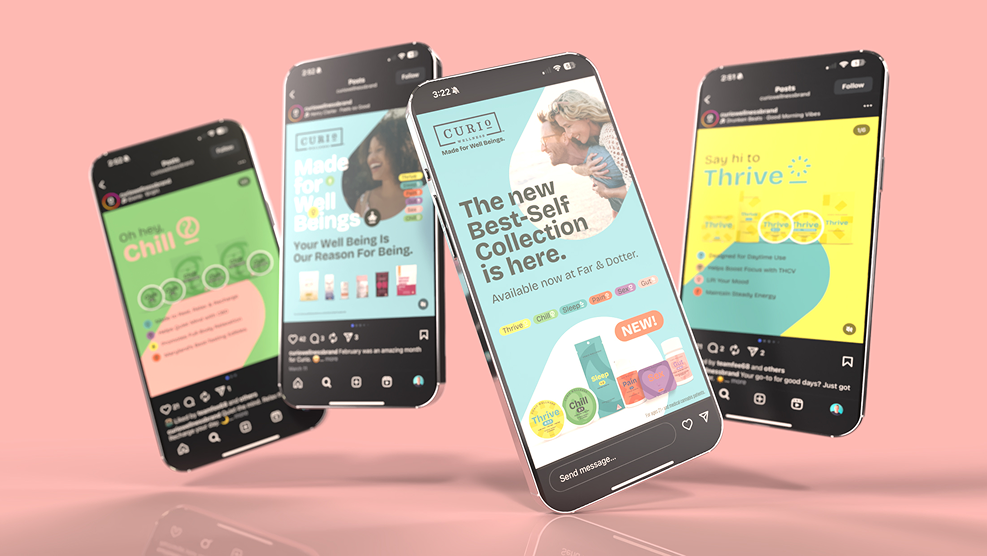
Social Media
Mobile involves much more than just responsive design. Heck, that’s just table stakes. We’re using mobile for the interface that it is, and making the most of it.
Social continues to be a dominant medium and a perfect place to communicate our brand efforts, and engage and involve cannabis enthusiasts of all kinds.
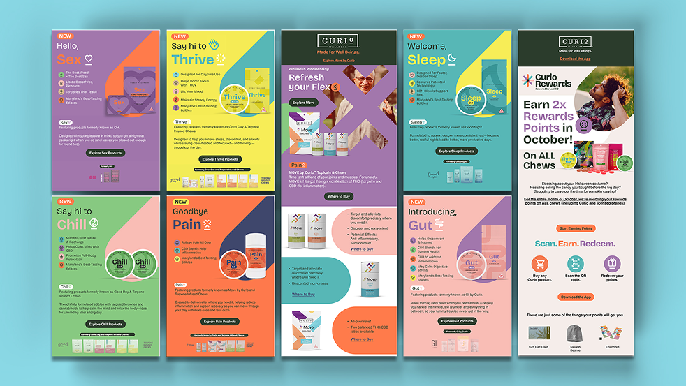
With a significant amount of regulation and, in some cases (especially in Maryland), limitations on cannabis mass media advertising, email continues to be a primary communication vehicle.
To us, it’s a great way to create and keep an ongoing relationship with our most dialed-in consumers in a simple, on-demand, and relatively inexpensive way.

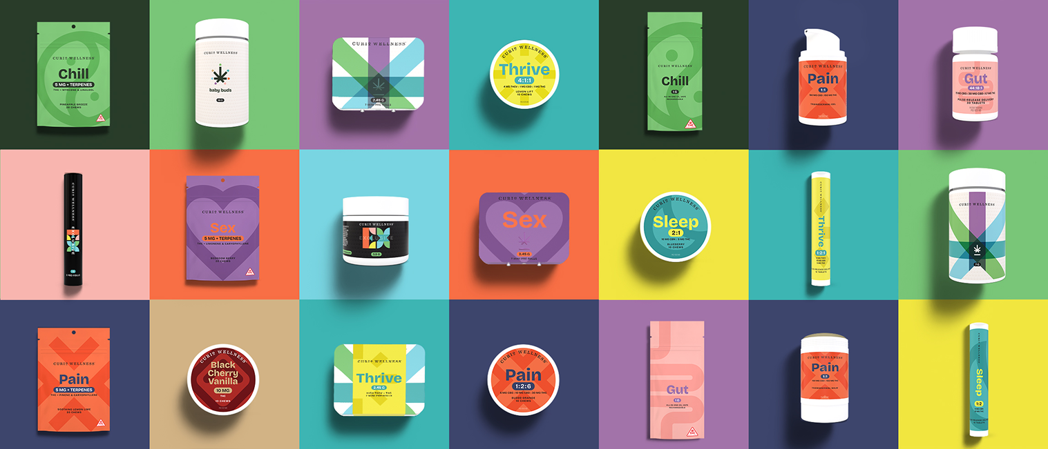
Packaging
Simple. Sophisticated. Premium. Our completely redesigned packaging reflects everything about the best-in-class products inside. But just as importantly, they’re designed to make finding exactly what you need as easy as possible.